The Story Behind a New Label
by Shannon Brock
April 4, 2016–Silver Thread’s 2015 wines are sporting a redesigned label. Although we like the current label, we thought a modified design could signal a stronger sense of place, authenticity and craftsmanship in each bottle. Keeping in mind that some people first encounter our wine at a restaurant or wine shop in Boston, New York City or Philadelphia, we wanted a new label to transport people to the Finger Lakes–the rocks, sky, water, foliage–and convey a premium, quality image. We knew we needed a redesign, but it took several months for inspiration.
Finally, the spark ignited in late September a few miles from the vineyard. My mother, my children and I were enjoying a glorious Indian Summer day at Lodi Point, a lesser-known state park that is a favorite refuge among Seneca Lake locals. The sun blazed overhead as if it were mid-summer and we rolled up our pant legs in order to wade in the balmy water. I began snapping photos of the rainbow-colored stones beneath our feet. Although we regularly visit Lodi Point, there was something about the light that day which made the beach magical. It was one of those moments that tells me we are living and making wine in one of the most special places on the planet.
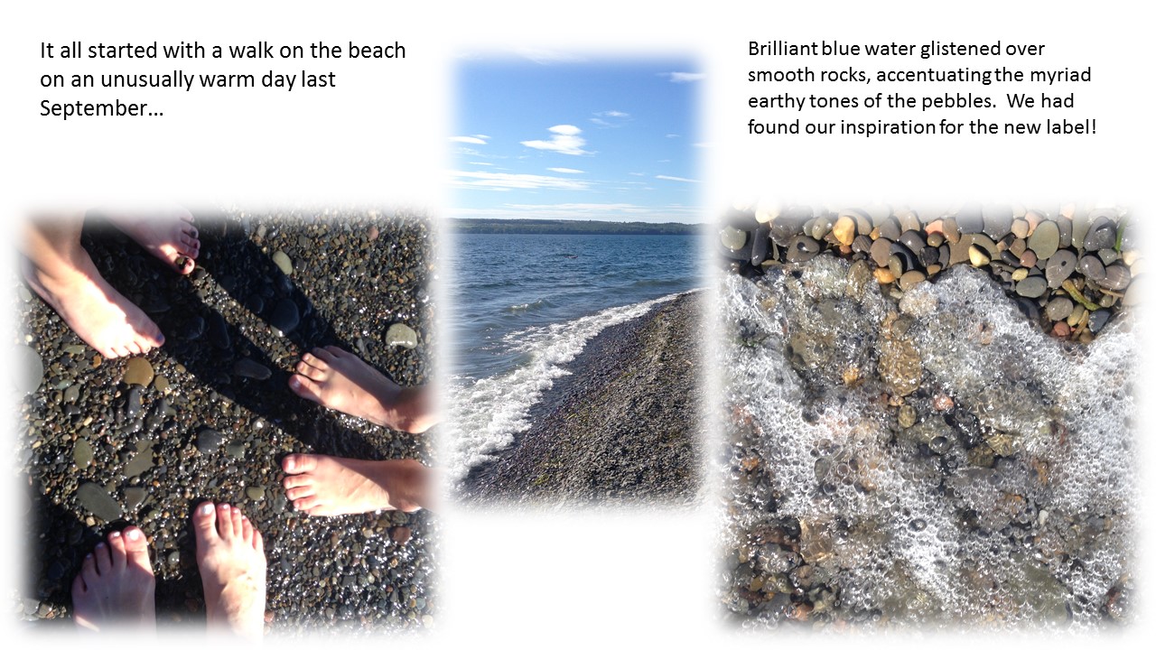
When I shared the photos with Paul, he immediately made the connection between the beach stones and the rocky soil at Silver Thread. The gray and blue stones are water-polished shale, the same crumbly rock that underlies our vineyard. The red, yellow, brown and white rocks are glacier-deposited stones, pieces of large boulders that were dumped as glaciers receded. Large versions of these brightly colored rocks “grow” out of the ground and regularly need to be picked out of the vineyard so they don’t obstruct the tractor.
A few days later, I contacted our label designer and told him we had the inspiration for the new label. It was right under our feet the entire time. We just had to pause for long enough to look down and notice it. The rocks and water at Lodi Point contributed shape and color to our label. A photo from our own vineyard, taken in 2013 during a drainage-improvement project, provided additional raw material. After several drafts, we settled on the label below (please excuse the misspelling of “Riesling”… which DID get corrected before the labels got printed).
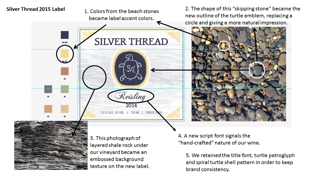
In addition to the imagery already described, we wanted the label to have texture that reflects the rocks of the Finger Lakes. Through the use of embossing, the labels have a background texture like the subsoil of our vineyard. We also used embossing on the turtle petroglyph to suggest a rock carving. Our logo is an authentic Native American artifact that was found carved into a granite boulder near the Bronx River and is on display at the New York Botanical Garden.
![IMG_3165[1]](https://silverthreadwine.com/wp-content/uploads/2016/04/IMG_31651.jpg)
The only wine currently released with the 2015 label is the Dry Rose of Pinot Noir. The single vineyard Rieslings and Good Earth White will follow this summer. We hope you agree that our new labels signal an elegant, premium wine with authenticity and a sense of place. Cheers!
